English
 Polski
 Spanish
 Italian
 German
 French
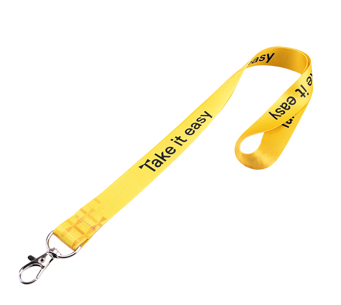
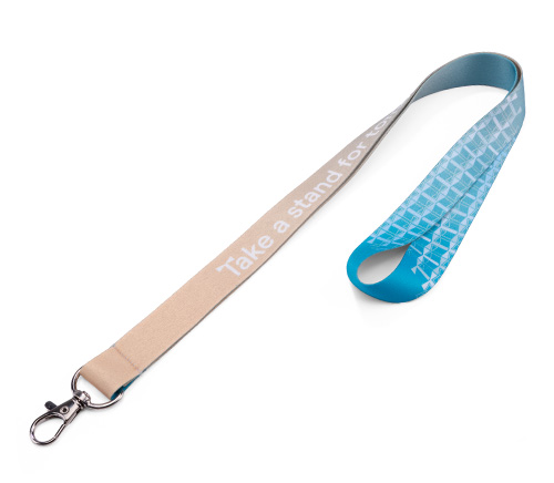
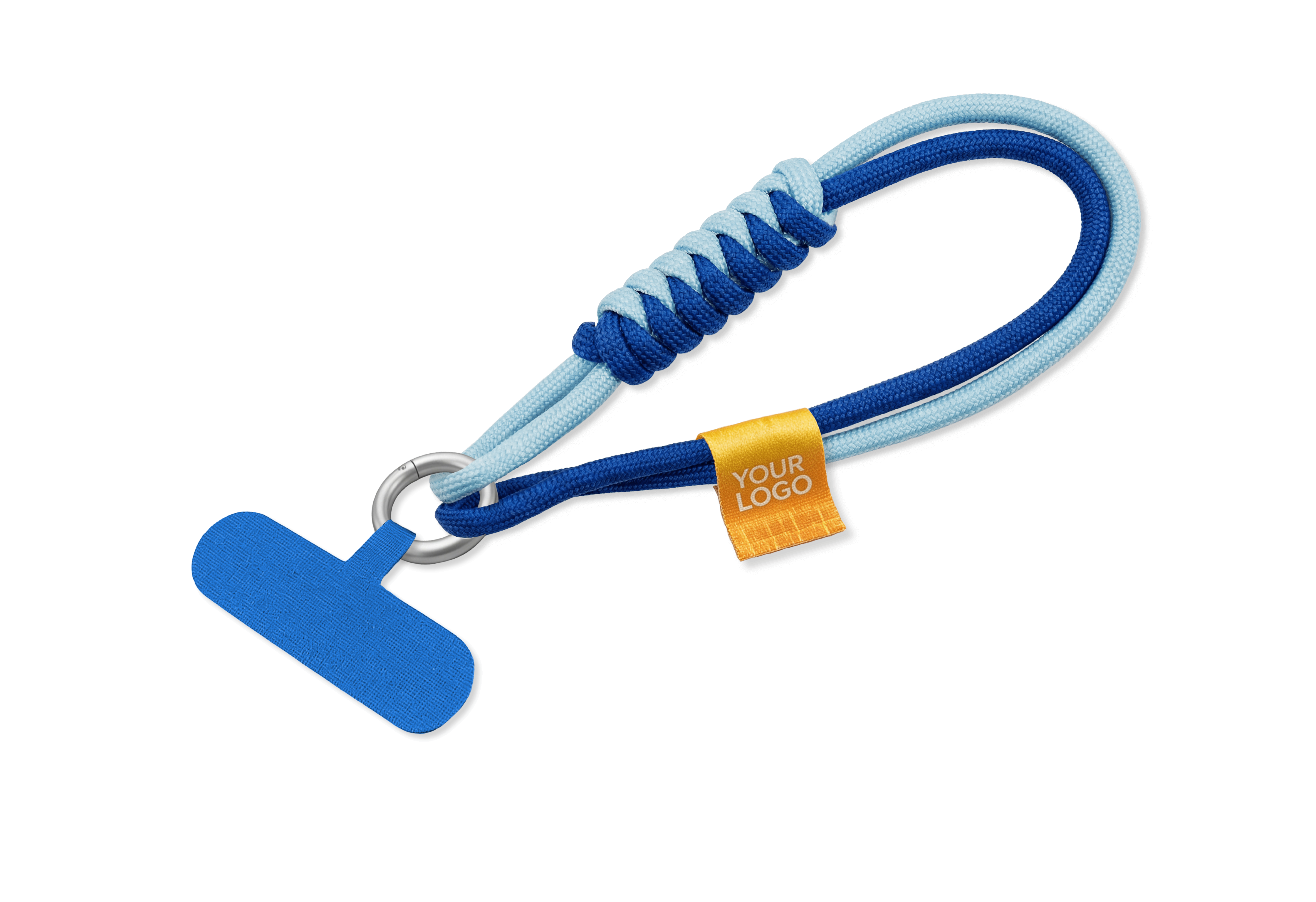

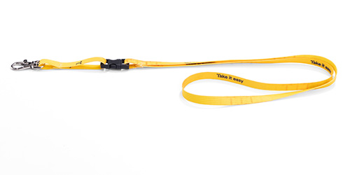
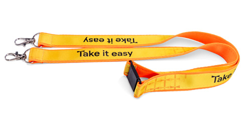
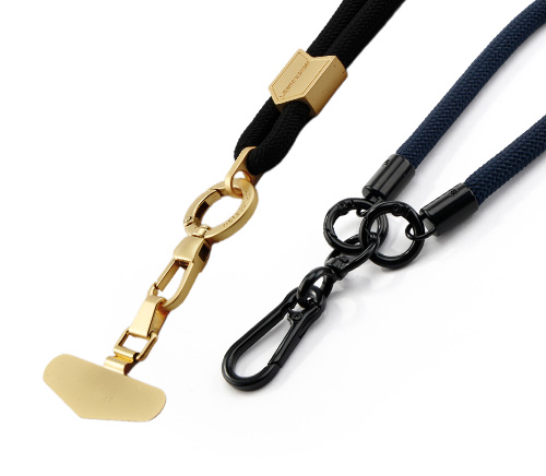








In this practical guide from TedGifted, we explain how to build lanyard artwork step by step. We examine technical templates, lanyard artwork dimensions, lanyard bleed requirements, internal margins, production-ready file preparation.
Table of contents
Designing promotional lanyards is notoriously deceptive for graphic designers and artworkers. The long, exceptionally narrow aspect ratio means that conventional design principles from flyers, brochures, or posters simply do not apply. A design that looks immaculate on your calibrated screen can easily fail in production: ignore bleed allowances, working margins, or sewing areas without pre-flight checks, and you will inevitably end up with cropped logos, distorted typography, and unreadable text.
In this practical guide from TedGifted, we explain how to build lanyard artwork step by step. We examine technical templates, lanyard artwork dimensions, lanyard bleed requirements, internal margins, production-ready file preparation, and the most frequent pitfalls encountered across the promotional merchandise industry.
Where to Start When Designing Lanyard Artwork?
When planning how to prepare lanyard artwork, never start with an arbitrary blank artboard or manually entered canvas dimensions. Professional workflow strictly begins by downloading the technical vector template supplied by the manufacturer.
Why every lanyard project starts with a template and how to interpret it
A bespoke promotional lanyard template forms the foundation of every production-ready file. It supplies every mechanical parameter needed to prepare the artwork accurately. Think of it as a technical blueprint mapping out how graphics will render on the finished merchandise. It clearly defines live print areas, stitch zones, total cut length, maximum permitted logo heights, brand asset positioning, full bleed margins, and minimum legible font sizes.
Professional manufacturing templates are structured using dedicated layers and colour-coded guides. Interpreting these lines accurately ensures smooth pre-press processing:
- Finished webbing width (finished trim size): The physical width of the final manufactured lanyard in the user's hand (e.g. 15 mm or 20 mm). It indicates the visible band width once excess bleed and hems are accounted for.
- Bleed allowance (gross format): The extended background area that your artwork must span edge to edge. This provides high-speed thermal transfer machinery with an essential safety buffer should the textile drift slightly along the heat platen.
- Internal safe margin: The inner perimeter separating essential design elements from the finished edge of the strap. Core branding, URLs, and typography must never encroach into this zone.
- Assembly safe zone: Designated hardware areas where the webbing is doubled over, folded, and bar-tacked with structural stitching. Stitching directly across a logo or slogan irreparably ruins the presentation.
Setting up your artboard using these parameters from minute one guarantees that no critical brand element is cropped or misaligned during finishing.
Important technical note: Always construct your design on a separate, dedicated artwork layer. Before exporting your final print-ready PDF or vector file, make certain to hide or delete the template guide layer. Failing to remove technical outlines can cause registration guides to print directly onto the finished polyester ribbon.
Matching your template to the target webbing width
The relationship between strap width and graphic layout is rigid. Manufacturers supply distinct templates for standard widths: 10, 15, 20, and 25 mm. Each size requires an altered vertical rhythm, different maximum asset heights, and distinct bleed proportions. Before laying down graphic concepts, ensure you have loaded the specific vector template tailored to the exact width and hardware configuration specified in your client's order.
Why working across different manufacturers' templates leads to costly production errors
Repurposing generic online templates or legacy files from another supplier is a frequent source of manufacturing rejections. Machinery profiles, heat calender tolerances, automated cutting units, and sewing jigs vary significantly between production facilities. Always build your files using the proprietary template supplied by the exact manufacturer executing the order.
A dedicated template streamlines the entire creative workflow, eliminating visual defects that remain invisible on screen and only surface once the order has come off the finishing line.
Webbing Dimensions and Graphic Design: What Must You Actually Account For?
Even the most striking brand layout will fail if forced into an unsuitable physical form factor. Furthermore, identical artwork scales differently across strap widths. When choosing a specific lanyard size, you must adapt your composition directly to the technical requirements of that strap.
10, 15, 20, and 25 mm widths: how band size dictates your layout
Standard industry widths for branded promotional lanyards comprise 10, 15, 20, and 25 mm. This band width dictates the printable surface available for logomarks, straplines, and corporate patterns. A composition that appears clean and legible across a generous 25 mm band will feel cramped, distorted, or unreadable if shrunk down to 10 or 15 mm. For this reason, artwork must always be evaluated within its dedicated template rather than treated as a one-size-fits-all canvas. Strap width and visual balance are fundamentally interdependent.
How much printable height your logo and typography actually have
The narrower the strap, the tighter the safe printable zone for typography and emblems. Before finalising and approving your file, inspect the artwork not merely at 400% zoom on a large monitor, but at genuine 100% real-world scale. This step quickly reveals closed-up typographic counters, overlapping letters, and compromised legibility. Manufacturers typically impose strict maximum asset heights (for instance, permitting a maximum 15 mm logo height on a 20 mm webbing band to safeguard proper margins).
Working within a long, narrow canvas: mastering visual rhythm and repetition
The physical length of a lanyard ribbon creates a distinctive layout challenge. Lanyard artwork for 10, 15, 20, or 25 mm bands extends across a strip that frequently exceeds 900 to 1000 mm before folding. You are designing for a worn, 3D textile product in motion, not a static rectangular print piece viewed in isolation.
How to Position Logos, Copy, and Repeating Elements on a Lanyard
Promotional lanyards function as continuous sequential media. Successful designs demand structural discipline and a methodical layout.
Continuous modular repeats vs. a single extended composition
The most reliable approach to lanyard design relies on modular, repeating patterns. Instead of attempting a complex, non-repeating horizontal illustration from end to end, establish a recurring sequence comprising the logo, tagline, and supporting details. This guarantees brand visibility from any angle when worn around the neck, regardless of how the ribbon naturally folds or rests. A rhythmic repeat creates an authoritative, polished impression while preventing visual clutter.
Dialling in the spacing and cadence between logos and messaging
Placing corporate logos and text blocks too close together impairs legibility, turning the ribbon into an undifferentiated horizontal blur when viewed from a distance. Maintain adequate negative space between modules so the eye can easily distinguish between the corporate mark and the message.
Designers routinely encounter three practical layout dilemmas:
- Horizontal vs. vertical or stacked logos
Horizontal brand lockups (icon to the left of the wordmark) are natively suited to ribbon strips measuring 10, 15, 20, and 25 mm. Complexities arise when working with tall, vertically stacked, or circular badges. Scaling a vertical lockup down to fit inside a 15 mm strap reduces the company name to illegible microprint. The industry standard fix is requesting the client's horizontal secondary lockup, or—subject to brand guidelines—rearranging the mark and wordmark along a single horizontal baseline specifically for lanyard production. - Lengthy corporate slogans
Clients frequently seek to imprint expansive brand statements along the band. Stretching an unbroken sentence across a 15 mm tape forces the font size down drastically. Rather than squeezing lengthy copy, segment it into modular semantic components. A reliable, well-tested cadence alternates elements sequentially: [Logo] → [Concise Tagline] → [Web URL] → [Logo]. - Symmetry and fold positioning.
When sequencing your repeating assets, evaluate where elements land once the strap is worn. Ensure critical branding elements do not fall dead-centre on the back of the neck fold or get trapped under the bar-tack stitching directly above the snap hook.
Ensuring sharp legibility on narrow 10 mm bands: the 1:1 scale test
On narrow promotional formats, legibility must take precedence over intricate decorative flourishes. Review every piece of vector typography before pre-press handoff.
Seasoned artworkers consistently verify their files by printing them or viewing them at exact 1:1 physical size. If small character counters choke or delicate serif strokes break apart at true scale, the layout must be stripped back. Manufacturers enforce maximum asset heights and minimum stroke weights per strap width; following these limits guarantees crisp reproduction on the transfer line.
Reading direction and graphic orientation when worn
A lanyard strap hangs around the wearer’s neck, curving over both shoulders and dropping down to the chest. Maintaining a uniform reading direction and consistent graphic orientation ensures your branding is instantly legible to approaching clients, visitors, and colleagues.
Bleed and Internal Safe Margins: What They Mean in Practice
Bleed allowances and internal margins protect your job against exposed white textile edges and trimmed text. They are the twin pillars of prepress precision; without them, even striking artwork will fall short on the factory floor.
Defining bleed and inner working margins on textile webbing
In commercial paper printing (such as business cards), bleed margins account for minor micro-shifts in high-speed guillotines. In promotional lanyard manufacturing, the mechanical dynamics are considerably more demanding. Lanyards are made from woven polyester webbing, not rigid paperboard. During heat transfer printing (especially continuous roll-to-roll dye-sublimation), the polyester ribbon undergoes intense heat and mechanical tension. The synthetic fibres stretch, settle, and track with microscopic variances. Strict bleed and margin compliance is therefore essential:
- Lanyard bleed allowance: The excess background graphic that extends beyond the finished trim width of the strap. Bleed specs vary by manufacturer and width; at TedGifted, our templates feature a precise 2 mm to 2.5 mm bleed per side (e.g. creating a 19 mm total gross file height for a 15 mm finished band, or 25 mm for a 20 mm band). Unlike paper trimming, sublimation bleed is absorbed directly during continuous thermal heat-pressing. Because woven ribbon may shift laterally along the calendar drum, this extra bleed prevents unsightly unprinted white polyester stripes along the edges.
- Internal safe margin:
The protective buffer zone that sets critical logos and text safely inward from the physical edges of the tape and stitch zones. Restricting primary assets within this boundary ensures that normal thermal shrinkage and edge variance will never clip or distort typography.
Why checking manufacturer-specific values is strictly non-negotiable
Always confirm dimensions against the official template supplied by your chosen manufacturer. Seeking generic dimensions online is risky. Print machinery, transfer calendars, heat tolerances, and automated cutters differ across factories; designing inside the verified template remains the only reliable route to production.
Typical defects caused by omitting bleed and safety margins
Omitting bleed almost always leaves unprinted, raw white edges if the band shifts on the calender drum. Conversely, ignoring internal safe margins leaves logos running right off the edge of the ribbon or buried under stitching threads.
Stitching, Terminations, and Assembly Areas: Critical Zones Designers Overlook
During layout, it is tempting to view a lanyard as an endless, flat strip of polyester. In reality, the physical product must be folded, assembled, stitched, and fitted with hardware. Not every millimetre of your layout remains visible once the lanyard is finished with clips and safety buckles. Always treat your artwork as a 3D functional item rather than an abstract, uninterrupted flat strip.
Accounting for stitch points during the concept phase
Where the ribbon connects to a metal snap hook or a breakaway safety connector, the textile is folded back on itself and secured with heavy-duty structural stitching. The stitch zone on a lanyard covers and distorts any design elements placed beneath it. Your artwork must treat sewing zones as high-risk buffer areas, populating them solely with neutral background colour or low-priority background patterns.
Keeping brand assets out of folding and attachment overlaps
A foundational rule of lanyard DTP: never position primary brand assets at the extreme physical ends of the ribbon layout. To attach a snap hook or oval clip, the webbing must be folded over and box-stitched. Part of your artwork is permanently concealed within these internal seams. When signing off on the layout, confirm that neither your core brand mark nor essential contact information coincides with the sewing line. Furthermore, keep in mind that custom specifications—such as opting for a non-positioned, continuous print—will naturally shift where graphics fall relative to hardware.
Treating the detachable lower segment as a standalone canvas
The short ribbon drop positioned below a plastic detachable buckle (directly above the snap hook) should be treated as an independent canvas within the template. The detachable buckle breaks the physical continuity of the ribbon, interrupting any repeating pattern extending from the main loop. Rather than trying to force an awkward continuation, use this distinct, flat-hanging segment to hero a key message—such as a single prominent logo, a primary web address, or a core brand strapline.
How to Prepare Print-Ready Files for Lanyard Manufacturing
A balanced layout and harmonious colour scheme are only half the battle. Delivering a technically flawless production file is just as vital. Adhering to standard technical specifications ensures your order moves through production smoothly.
Vector vs. raster assets: what ensures clean production
Vector formats are always the preferred standard for lanyard production. Supplying lanyard artwork in vector format guarantees razor-sharp edges and crisp typography regardless of scaling. If your design must incorporate raster graphics (such as photographic motifs), verify that:
- Assets have an effective resolution of at least 300 dpi at true 1:1 scale,
- Bitmaps are embedded directly within the parent document rather than linked,
- Images are mapped to the proper colour workspace.
Industry-standard file formats accepted by trade manufacturers
When preparing production files for promotional lanyards, stick to proven trade standards. Manufacturers prefer open or press-ready vector formats:
- PDF (exported using high-quality press-ready standards—our recommended file format),
- AI (native Adobe Illustrator vector files),
- EPS (encapsulated PostScript vector files),
- SVG (scalable vector graphics).
Converting live typography and strokes to outlines
Converting live fonts to outlines is an indispensable step before generating press files. Converting text transforms font characters into unalterable vector paths, preventing accidental font substitution if the pre-press rip station lacks your specific typeface. This ensures your custom typography prints exactly as designed.
One vital pre-press detail often overlooked by junior designers is expanding strokes. Outlines, frames, and stroke paths must also be expanded into filled vector shapes. If fine lines around a logo remain active strokes, automatic scaling by RIP software or plotting systems can alter their stroke weights unevenly. Structuring your file entirely out of closed compound paths reliably safeguards the design against unintended distortion.
Pantone matching, CMYK workflows, and textile ink absorption
Colour reproduction behaves differently on woven synthetic fabrics than on coated paper. Calibrated monitors emit light within an RGB colour space, delivering brilliant, vivid hues. In contrast, woven polyester ribbon absorbs dye under heat, making a 1:1 visual match more nuanced. Most branded lanyards (notably those produced via full-colour dye-sublimation print) are processed through high-definition CMYK engines. Specifying an exact Pantone solid coated reference number is not a substitute for proper colour management, but it provides the press operator with an essential benchmark. By entering precise Pantone codes, technicians can calibrate colour output curves so the finished ribbon matches your brand identity as closely as the textile chemistry allows. Keep in mind that certain out-of-gamut Pantone shades (such as fluorescent neons or deep metallic sheens) can only ever be approximated when using process sublimation inks.
Problematic visual effects that disrupt RIP processing
Modern vector software makes it easy to add rich visual enhancements. Unfortunately, hardware RIP (Raster Image Processor) units can struggle to interpret complex vector effects reliably. The most common technical culprits causing post-rip errors include:
- Unflattened drop shadows beneath vector layers: Can output as opaque black boxes around logomarks.
- Complex vector transparency layers: Overlapping semi-transparent paths can be misread or dropped during plate generation.
- Advanced layer blending modes: Modes like *Multiply*, *Overlay*, or *Soft Light* rarely translate to dyed textile fibres as they appear on back-lit displays.
The safest solution is selective rasterisation. Retain all clean text, brand marks, and graphic rules as pure vector paths to protect edge sharpness. Meanwhile, flatten complex background textures, shadows, and gradients into a single, high-resolution 300 dpi raster background in CMYK before exporting your print-ready file.
The Most Common Pitfalls in Lanyard Artwork Design
Experience shows that artwork errors on promotional lanyards stem from a small group of recurring oversights. Review this breakdown to streamline approval and keep your order on schedule:
A step-by-step breakdown of frequent pre-press errors
Even experienced graphic designers can slip up when working with narrow textile media for the first time. Familiarise yourself with these common pre-press pitfalls to avoid unexpected delays:
1. Ignoring manufacturer templates and guidelines
- Problem: Designing on a blank canvas, using generic third-party web templates, or building artwork in office suites (such as Word or PowerPoint) rather than professional vector software.
- Impact: Artwork misaligns with finished strap edges, and non-DTP office files are rejected due to incompatible colour profiles and uneditable layouts.
- Solution: Always download the official, up-to-date vector template (PDF, EPS, AI) directly from the manufacturer producing your job.
2. Overlooking margins and safe printing zones
- Problem: Placing key logos or contact copy right up against the edge of the webbing, or dead on the seam line.
- Impact: Natural tracking of elastic woven polyester cuts off characters, while sewing needles pierce logos, rendering them unreadable.
- Solution: Adhere strictly to the safe boundary markers indicated on the manufacturer's template. Leave stitch areas clear, using only continuous background colour or low-priority background textures.
3. Cramming tiny details onto narrow webbing
- Problem: Specifying micro-logos and tiny typefaces in an attempt to fit complex marketing messages onto a narrow strap.
- Impact: Capillary ink action causes miniature text to blur into illegible blocks, while fine icon details bleed into indistinct dots.
- Solution: Pare back your composition for narrower ribbons and verify readability using 1:1 true-scale on-screen checks.
4. Exporting live, unoutlined typography
- Problem: Exporting production files containing live type without outlining fonts into vectors.
- Impact: The manufacturer’s RIP software will lack your corporate typeface and substitute a generic default font (like Arial or Courier), compromising the visual identity.
- Solution: Select all typographic elements and convert them to outlines or paths prior to generating your press-ready PDF. Outlining locks letterforms into unchangeable vector shapes.
5. Submitting low-resolution raster assets
- Problem: Placing low-resolution web bitmaps, JPEG screen grabs, or compressed images into the artwork.
- Impact: Bitmaps print soft, pixelated, and muddy onto the woven ribbon, noticeably undermining overall product quality.
- Solution: Verify that all embedded photographic elements and raster artwork are supplied at an effective resolution of at least 300 dpi at their final printed dimensions.
6. Leaving live transparencies and effects unflattened
- Problem: Supplying vector documents that contain complex live transparencies, drop shadows, gradient meshes, or unflattened blend modes.
- Impact: RIP engines can misinterpret live vector effects, printing harsh borders, discoloured background tiles, or completely dropped design layers.
- Solution: Selectively rasterise problematic effects and shadows into high-resolution 300 dpi CMYK background assets, while leaving primary logos and text as crisp vector paths.
The vast majority of pre-press file rejections stem from straightforward technical oversights rather than aesthetic issues.
Pre-Flight Checklist: Verifying Lanyard Artwork Before Submission
Need absolute peace of mind before handing off your artwork? Use this lanyard artwork checklist as your pre-flight safety net:
- Are you building the project within the official template from the contracted manufacturer?
- Does the template match the specified strap width (e.g. 10 mm, 15 mm, 20 mm, or 25 mm) and chosen hardware assembly?
- Is the artwork built at accurate 1:1 production scale?
- Do all critical logos and copy sit comfortably within the designated internal safe area?
- Does the background artwork extend fully to the outer bleed line?
- Are stitch points and hardware assembly zones kept free of primary brand graphics?
- Have all typographic layers and line strokes been expanded and converted to vector outlines?
- Do embedded bitmap graphics meet the minimum 300 dpi resolution requirement?
- Are colours defined accurately using CMYK workspaces or specified Pantone solid coated references?
- Is the file exported in an accepted vector format (ideally high-resolution, press-ready PDF, EPS, or AI)?
- Does the entire visual composition remain crisp and legible when inspected at actual 1:1 scale?
What are the standard dimensions for lanyard artwork?
Lanyard artwork dimensions depend on the selected band width and the specific manufacturer's production template. The promotional industry primarily relies on 15 mm and 20 mm widths, alongside 10 mm and 25 mm options. Always construct your artwork inside the official vector template to ensure accurate printable zones.
How much bleed must be added to lanyard design files?
Lanyard artwork requires between 2 mm and 2.5 mm of bleed on each side of the webbing, translating to a total gross artwork width that accounts for the finished band plus top and bottom bleed allowances. Tolerances vary by machinery and calender setup, so consult your supplier's technical sheet. At TedGifted, standard gross artwork dimensions are:
- 10 mm lanyard: 2 mm bleed per side → 14 mm gross width
- 15 mm lanyard: 2 mm bleed per side → 19 mm gross width
- 20 mm lanyard: 2.5 mm bleed per side → 25 mm gross width
- 25 mm lanyard: 2 mm bleed per side → 29 mm gross width
Does lanyard artwork have to be supplied in vector format?
Supplying lanyard artwork as vector files is strongly recommended, as vectors maintain crisp, clean edges on text and brand marks regardless of scale. High-resolution raster images (such as photographic bitmaps) are acceptable provided they are supplied at a minimum resolution of 300 dpi at final printed size.
Which file formats do lanyard manufacturers accept?
Lanyard manufacturers primarily accept open vector formats: press-ready PDF (the industry standard), EPS, native Adobe Illustrator (.ai), and SVG. Avoid sending low-resolution web images (such as JPEGs or PNGs) or office application files (such as Microsoft Word or PowerPoint).
Do all fonts and strokes need to be converted to outlines?
Yes, converting fonts to outlines is a mandatory pre-press requirement. Outlining transforms live fonts into permanent geometric paths, protecting your file against missing-font errors or unintended typeface substitutions when opened at the manufacturing facility.
How do I prevent logos from being clipped by the stitching?
Always follow the designated stitch safe zones indicated on the manufacturer's template, keeping these areas free of critical brand assets. Run only the continuous background colour or pattern across these zones. Placing a logo inside the stitch area exposes it to needle punctures and distortion during assembly.
Pantone vs. CMYK: which colour mode is preferred for lanyards?
Select one unified colour approach for your file: CMYK or Pantone. You can construct your artwork in CMYK, which matches the process inks used in dye-sublimation. Alternatively, if your brand identity relies on Pantone references, specify those coated numbers in your order notes. Press technicians use these references to calibrate profiles, bringing the printed textile as close to your brand colours as fabric chemistry allows.
How can I test whether my logo will remain legible on the finished band?
Zoom your on-screen preview to genuine 1:1 physical size (for example, matching a physical ruler against a 15 mm strap height). If letterforms blur together or the logo loses definition at true scale, enlarge the key branding elements. As a practical baseline, avoid typographic characters with a cap height below 1.5 mm.
Summary
Successful lanyard design starts with using the correct manufacturer template, which establishes the true live area, bleed allowances, and working margins. The next steps involve tailoring your composition to the strap width, checking the legibility of logos and text, and steering clear of functional zones like stitch points and hardware attachments. Final quality checks before file handoff bring the process together.Delivering an accurate production file is 20% creative design and 80% disciplined pre-press execution. Starting from a verified template, converting fonts to vector paths, including generous bleed, and protecting stitch areas ensures your finished branded lanyards look just as sharp in hand as they did on your calibrated monitor.